DISCOVERY
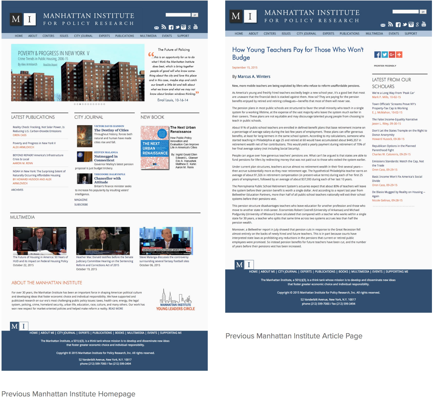
At the outset, we faced a few challenges with MI’s online presence:
- Foundational Cracks: Despite its wealth of content and contributors, the old MI site was hampered by an outdated design and inefficiently architected system infrastructure.
- Search and Discovery: Without a universal system to organize and connect MI’s various types of online content, it was challenging for users to search for and discover information.
- Central Management: There was no centralized administrative mechanism to update MI’s web properties, making maintaining MI’s site and all its attendant micro-sites a complex task.
- User Engagement: MI site was a static one-way information repository, leaving some of its greatest resources—its content and its audience—untapped and unengaged.
- Reader Experience: The many pages and micro-sites related to MI had inconsistent and crowded designs, resulting in fractured branding and making for a cumbersome reading experience.
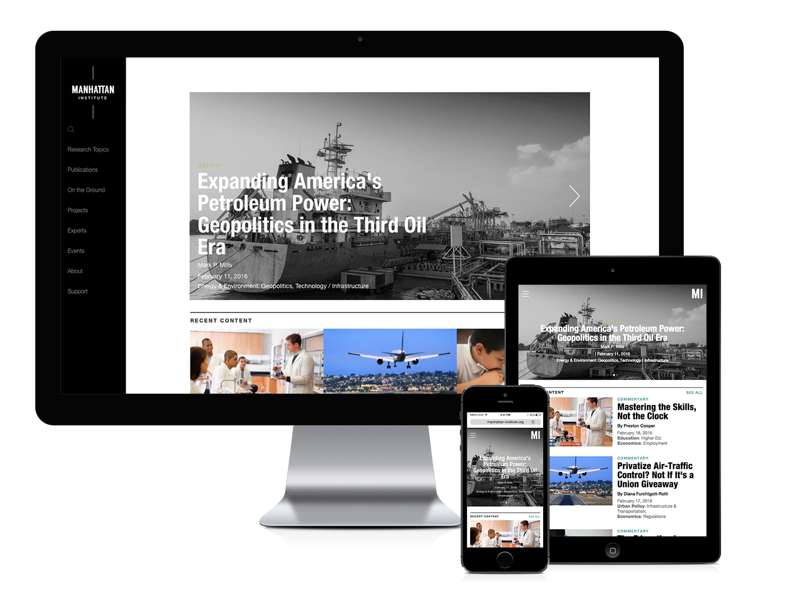
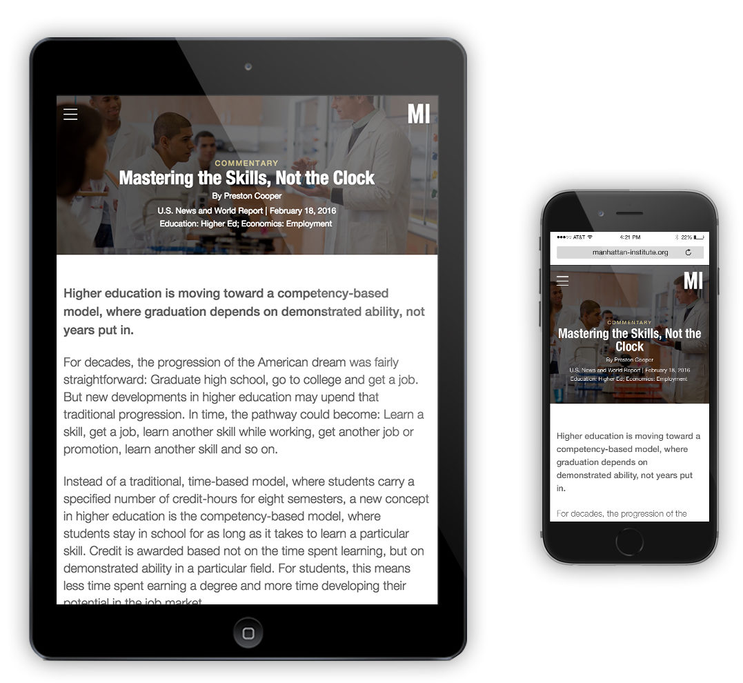
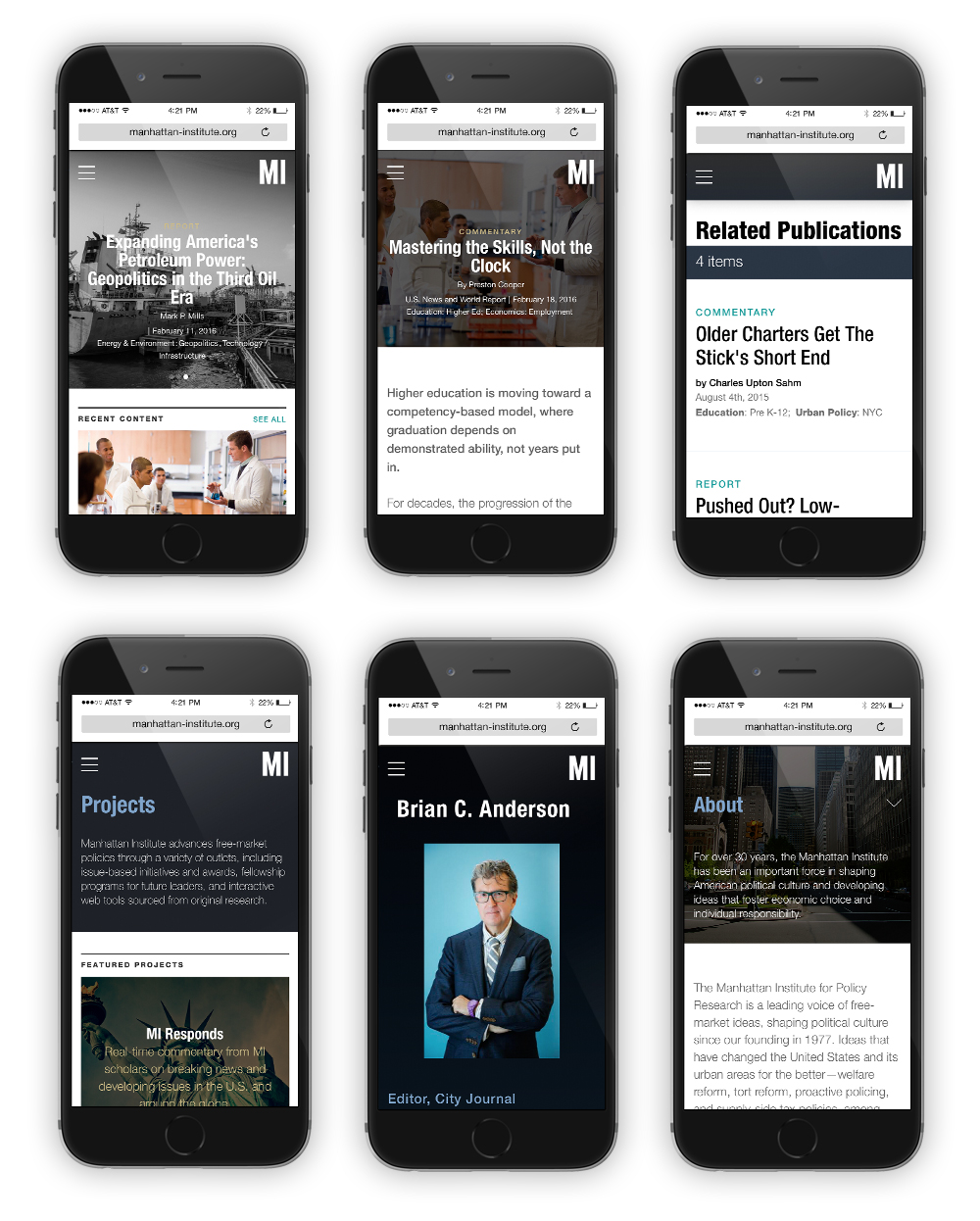
- Mobile: The site was available only in desktop form, limiting the ways readers could access it as well as MI’s ability to reach a significant population of mobile-only readers.
With these challenges in mind, we set out to do a full assessment of what MI wanted to have on their new website (and brand), and what the new site should do.
A FULL REBRAND & BEYOND
Before we could begin to think about revamping MI’s website, we needed to completely overhaul MI’s branding and the branding for one of its properties, City Journal. In order to approach the daunting task of rebranding an established 35+ year old think tank, we sat down with stakeholders to do a full brand analysis—where is the brand being used, where does it need to be strengthened—as well as an exploration in the institution’s design aesthetic.
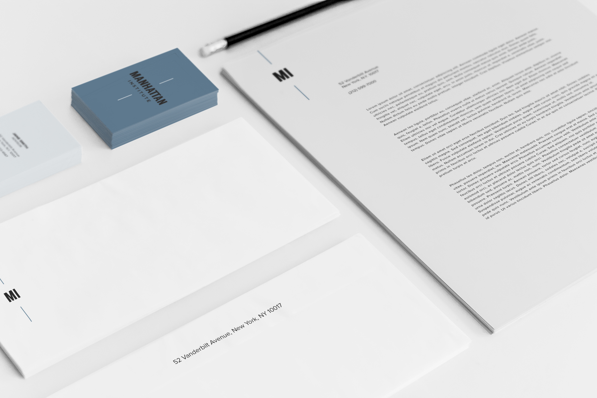
Ultimately, the rebranding process resulted in a comprehensive overhaul of MI’s brand presence. We designed two logos for MI (a full version and an abbreviated version), brand collateral (business cards, letterhead), new templates for downloadable content and email marketing, a new style sheet, and a new logo for City Journal. We even recommended structural change within the organization to keep the MI brand consistent across properties (more on this below).
CONTENT MANAGEMENT & USER ENGAGEMENT
An Information Architecture Overhaul
Because the content on the old MI site had been gradually added over the years, the site’s overall information architecture was convoluted and unintuitive. With the MI team and a UX/IA expert we brought in for the project, we mapped MI’s entire existing site and then created a whole new sitemap based on their desired priorities.
One feature to come out of this process was stronger and clearer organization for MI’s internal “Centers.” For years, MI had been using these centers as a hub for research on various topics (Center for Energy, Center for Health, etc.), but each were independent of each other and independent of the overall MI brand. By rearranging the information architecture of the site, we were able to do away with the title of “Centers” and integrate their content into the mother-brand of MI. We used the newly designed abbreviated MI logo to change the name of these centers to “MI Health” and “MI Energy”—strengthening the branding of these research projects—and then integrated them into MI.org as the basis of the “Topics” section.
Search Tools & Content Tagging
In order to accommodate the content from MI’s site and its various properties, we had to come up with search and management tools that would make it easy to discover and create content on more than one website. To solve this challenge, we created a related content metric that took into account content and relationships from all MI-owned websites (Manhattan-Institute.org, City Journal, e21, etc.). Further, we developed cross-posting rules across the various sites to manage the large volume of content for MI’s team and to make search and discovery easy for the user.
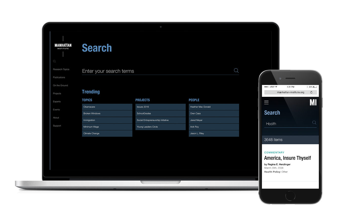
The result was a comprehensive tagging and search functionality to allow users to quickly and easily find information of all types across their sites (including articles, video, podcasts, events, etc.).
User Engagement
Through a thorough review of MI’s web analytics and intensive meetings with key MI stakeholders, we created a list of prioritized target markets and the goals/desired actions for each of those markets. From there, we outlined a unique set of features to drive further user engagement, such as allowing registered to users to follow specific topics and/or authors and to save articles for later reading.
DESIGNS FOR ALL CONTENT
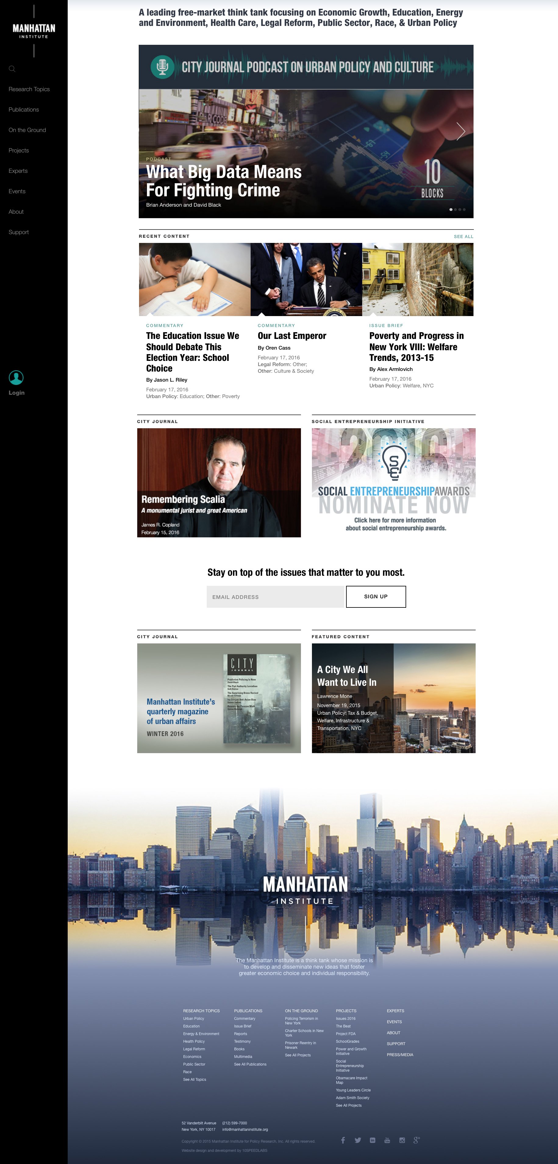
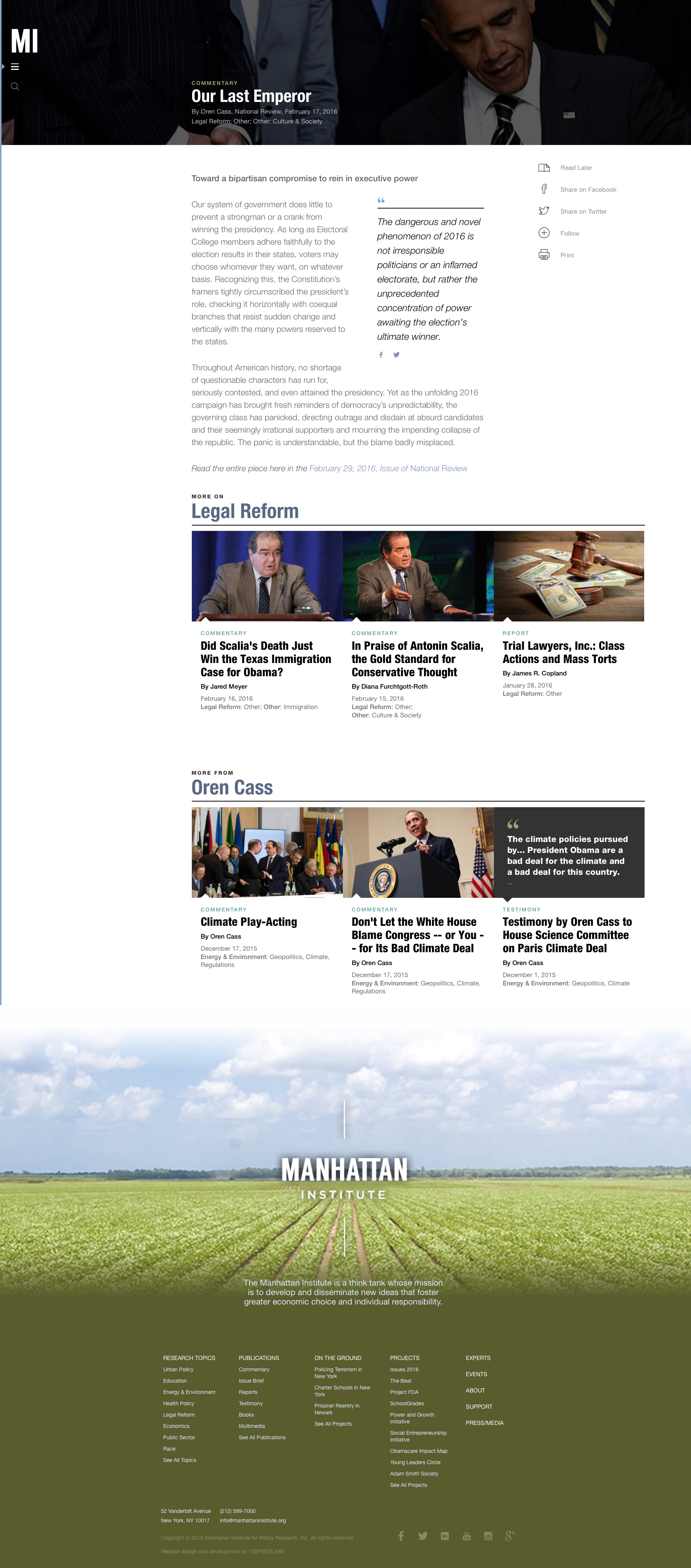
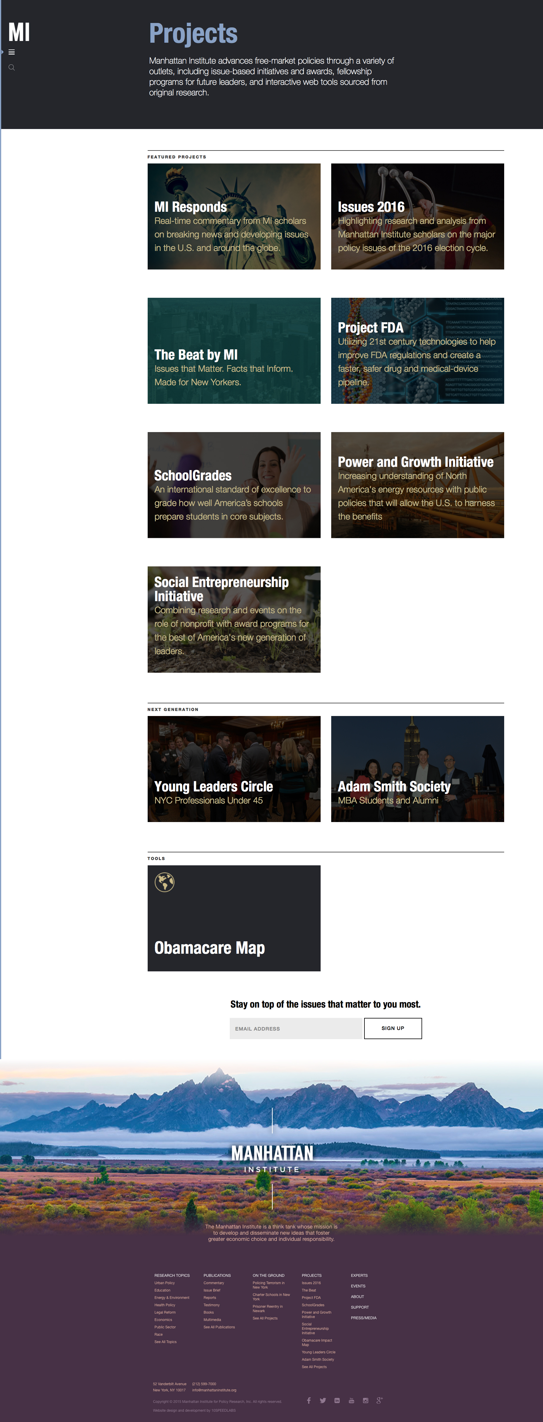
Once we had settled on the branding and the scope of the project, it was time to start designing templates for the website. Through the design phase, we created hundreds of templates for three different MI-owned websites to feature all the various types of content. We also redesigned their outgoing newsletter templates to match the newly revamped article pages on the website.
A POWERFUL DRUPAL CORE
In order to allow for all of the various cross-site features and large volume of content on MI’s sites, we created a customized Drupal multisite backend. Through one central content management system (CMS), MI is able to access content across all of its various properties. Content from each of the MI sites can not only be searched on MI’s main website, it can also be featured in various templates across the site—this allows MI to “upsell” all of its content through related publications.
We then complimented the Drupal core with the powerful search engine tool Apache Solr, which allowed us to apply our robust related content metric and cross-site tagging. Users who are searching for specific publications or projects can easily find content from across MI and its various other properties (City Journal, e21, etc.). For users who are looking to learn more on a topic, the search tool also recommends trending topics, projects, and authors, as well as intelligently suggesting publications related to their search terms and ranking search results based on relevance.
