Jovial is a family-owned Italian specialty foods company devoted to producing products that are “inherently good”—grown by local farmers from the purest plant varieties. They use a variety of wheat that was first harvested more than 12,000 years ago, and they nurture all their products from seed to shelf… But they needed help nurturing their brand, on web and in print. We immediately identified with jovial’s commitment to producing only the best— and our hunger to help them knew no bounds. We built a website, and redesigned another. We crafted a new logo. And we helped devise their social media outreach strategy.
WEB PORTAL TO LUCCA
It began with a getaway— a culinary getaway, to be exact. Jovial approached us to redesign the website for the weeklong culinary retreats they host at their 18th-century tuscan villa, near where the company’s pasta is made. Guests stay in the villa and enjoy cooking classes with a celebrity chef and local artisans.
We designed the website to be a mouthwatering preview of experience itself. Every page showcases breathtaking imagery from the villa, transporting visitors to the villa before they arrive and guiding them to make their reservations.
The graceful simplicity of the design is reflected on the administrative backend. We made it easy for the website to expand while remaining visually consistent. Adding new getaways is quick and painless and key content areas are easy to edit via the cms.
We crafted a signature logo for this signature experience that is at once distinct from and in harmony with the style of the main jovial logo. After close consultation with the founder, the exploration of multiple options, and extensive revisions, we arrived at the perfect final result.
COOKING UP A MAIN SITE REDESIGN
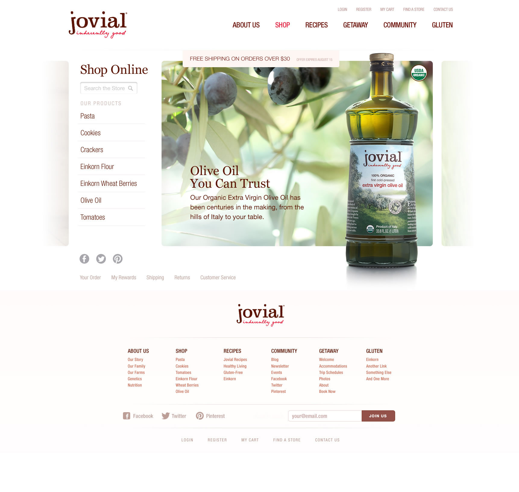
We have also redesigned jovial’s main website so that it is responsive to user interactions, works across all devices, and reveals the purity of their products through a clean, easy-to-navigate layout and enticing imagery. The pictures tell the story, and they resize to fit every page.
The site is both administrator— and user-friendly. Product pages can easily be adjusted, and balance streamlined text with visually-arresting images. Products are featured on relevant recipe pages (and vice versa) for cross-promotion. There’s even a section where visitors can see how every product is grown.


