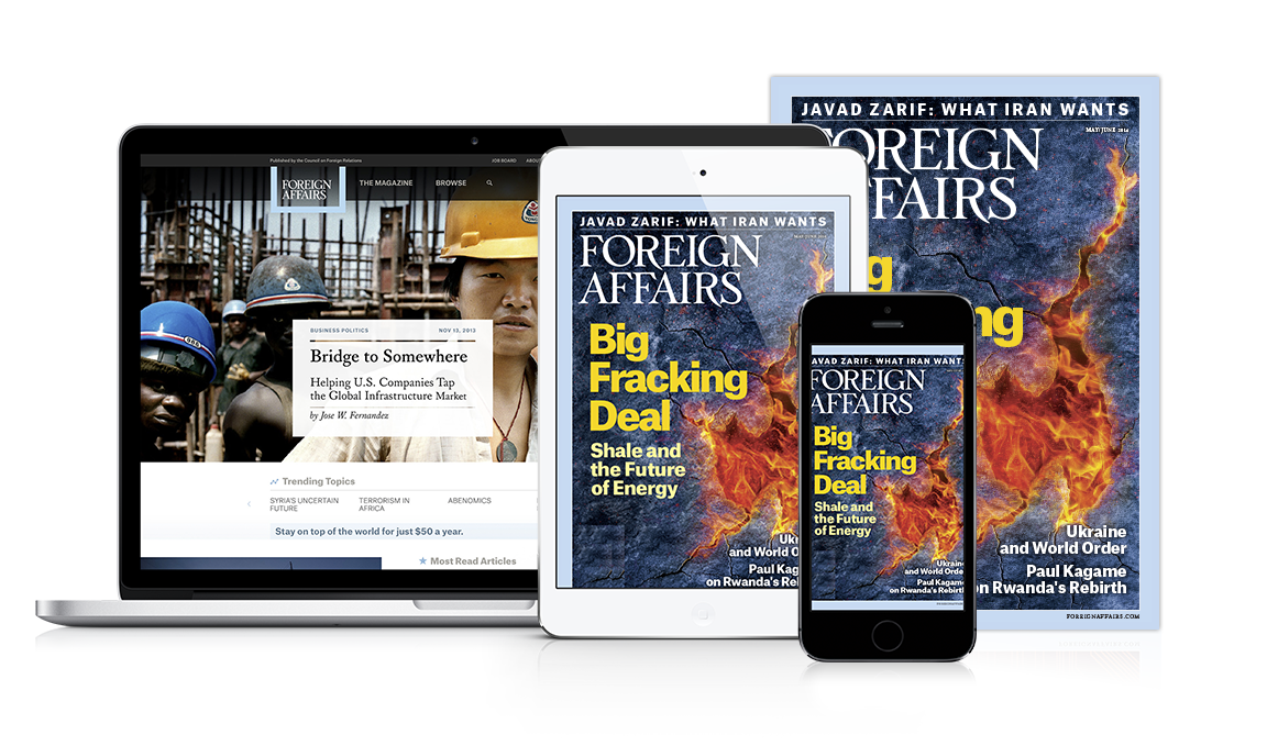
Since 1922, Foreign Affairs (FA) has been America’s foremost publication on global politics. Contributors include leaders and thinkers like Barack Obama, Henry Kissinger, and Francis Fukuyama, whose essays are read by academics and policymakers worldwide.
FA asked us to design a site that leveraged emerging web tech to emphasize their existing strengths and open new editorial and business opportunities.
DISCOVERY
Because there were so many unknowns to address before we began designing, our project plan included a one-month “Discovery” phase to familiarize ourselves with FA’s operations, and begin generating ideas for the new site.
These discussions were fast-paced and intensive (we met onsite with FA 3–4 days each week). We had extensive discussions with key stakeholders across all departments, and breakout sessions with specific teams, like editorial, business, ad sales, development, and FA’s internal analytics specialist.
After a month of discussions, the Discovery phase culminated in a detailed plan for the new site.
We still hadn’t designed a pixel. But we had taken a project with numerous open-ended questions, and turned it into an actionable project plan that answered those questions with innovative ideas.
HOMEPAGE DESIGN
Something for everyone.
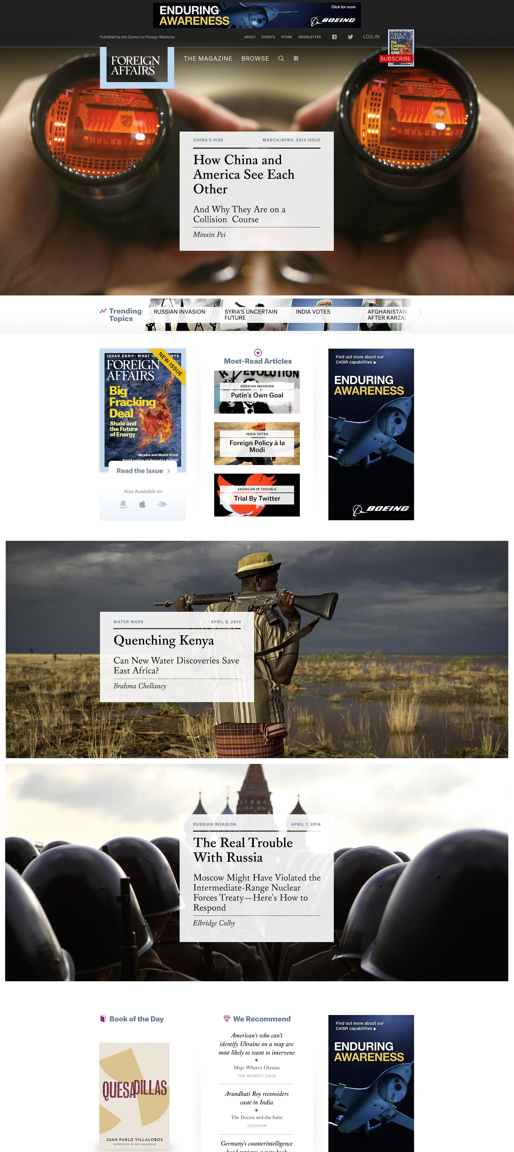
Designing a magazine’s homepage is a balancing act. The page needs to highlight new content, provide entry points to old content, sell subscriptions and special offers, and include space for display ads. Ideally, it does each of those equally well.
With FA, striking this balance was tough because of a key difference we noticed among their online readers: many FA users visit the site daily, but an equally large share visit less frequently—often once a week or less. The FA team understood that when it comes to the homepage, those two groups have very different needs.
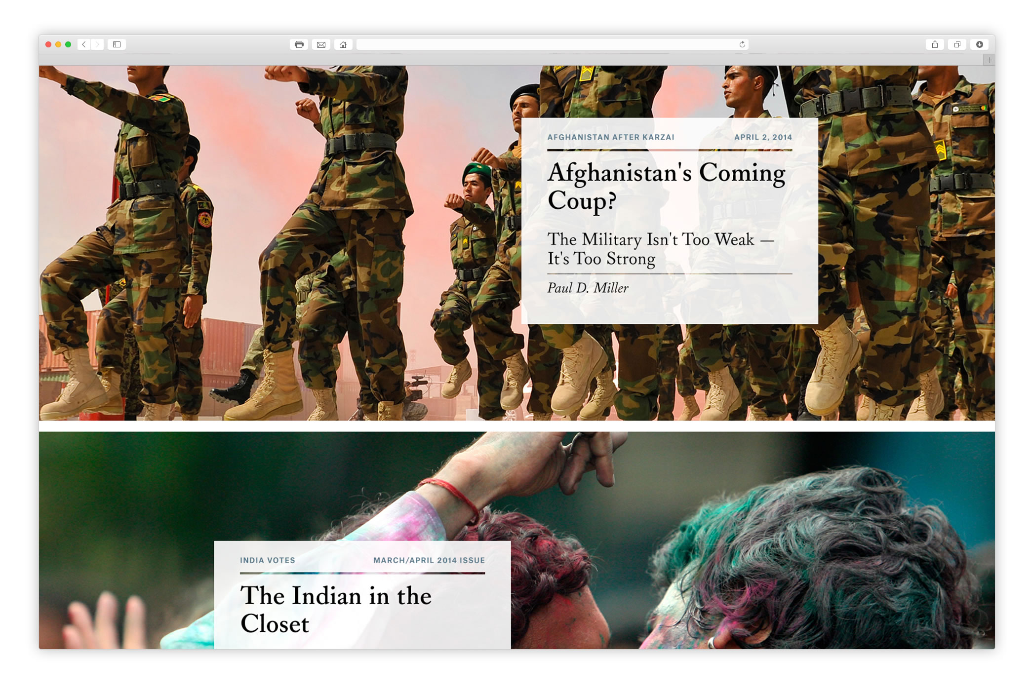
What we created was a stunning, imagery-driven homepage broken up my changing modules. We featured full-width image slides to leverage Reuters’ fantastic photography. We seamlessly integrated sponsored content and advertisements in a way that draw attention but don’t distract. And we created a design that caters to both frequent and infrequent visitors by giving them ways to toggle their view from standard to “list” format.
DIVING DEEP WITHIN THE “TIMELINE”
During our pitch—the very first time we met with FA—we proposed a feature called “the timeline”: a scrollable, chronological listing of all articles FA ever published on a topic. A timeline would appear on every article page, giving users an easy way find related articles from any point in FA’s history.
The result was a timeline that not only provides suggestions for related articles, but allows the reader to filter by topic and time period, all on a visual “density bar” that displays the number of articles published by FA on any topic by year.
ARTICLE PAGE
A classic style becomes cutting-edge.
Many parts of the old FA site had fallen behind the times, but none more so than the “article page,” the page template used for all editorial content. Visually, it was off-brand, and there was little in its feature set that enhanced the reading experience.
As our Creative Director put it, it was important to “bring the values of print to the web.” To establish continuity across FA’s editorial offerings, we decided to use the FA style guide as the basis of our article page’s look and feel. We even added the FA colophon at the end of each article.
We also realized that if FA increasingly ran interviews, videos, and photo galleries along with their signature essays, one article page design wouldn’t cut it. So after we established the general format, we adapted it to each content type.
To really make the FA’s online articles equal to their print equivalents, we had to include the same “functionality” that paper offers: namely, you can write all over it, then file it away. In addition to the usual social sharing tools, registered users can add a note or highlight text, generate a citation for the article, or save the article on their account page on any device.


