This is the third and last post in a series I've been sharing on how we've significantly improved the conversion rate of our landing page here at Rockstar by 500%. If you missed the previous posts, here's Part 1 and Part 2.
Don't Waste Your Time on Jobs To Be Done Interviews
Jobs to Be Done (JTBD) is the new hype in doing user research to make great products. There's a lot of good stuff there. They're also really hard and take a ton of practice to do right.
And there's a really easy shortcut you can implement immediately. Which is simply using the words you hear your customers using on your website. It's that easy. But few people pull this off.
At Highrise CRM, we had a concept of a "Task". It's a bit of a to-do on a to-do list. The button is called Add Task. And it essentially sets up a reminder to do something in the system. Like "Call Joan Smith."
But as we talked to a bunch of users, we kept hearing them say "I love Highrise because it helps me follow-up." They weren't talking: tasks or reminders or to-dos. They talked about "follow-ups".
Now, it's one thing to use that knowledge to fuel a directional change in your product, but the easiest thing you can do, today, is change your landing pages to use "Follow-up" instead of anything else. We did and we saw a 35% bump in our conversion rates.
When I came to Rockstar and began talking with customers I kept hearing a common complaint. "Hiring is Hard." It was a pattern.
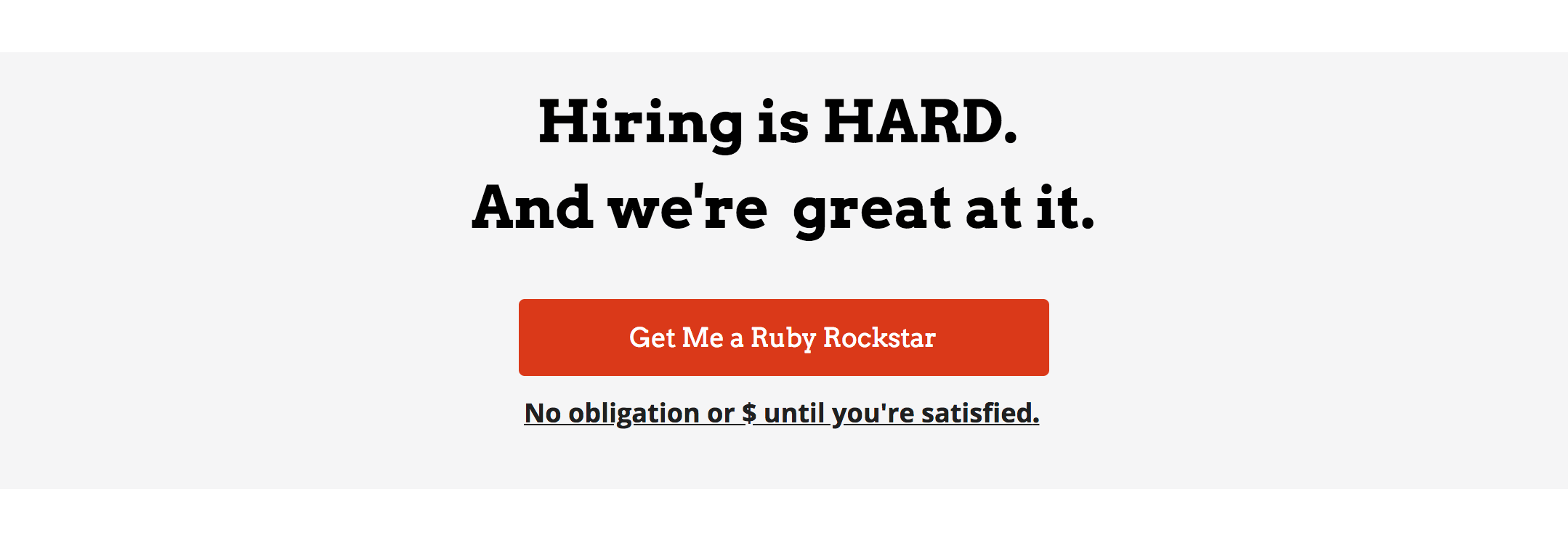
So voila, I have a new Headline to use.

"Hiring is HARD. And we're great at it."
Now I've started seeing our competitors use that language in their ads. Stolen from us? Who knows. They might have also just kept hearing their customers use this language constantly.
Of course, do some real JTBD interviews if you think they'll be useful, but in the meantime just start with the tried and true method of having conversations with your customers and listening for patterns in the words they use. Then write down those words!
Don't Waste Your "Features" on Me-toos
Most product landing pages have some form of feature callouts. You know the area. It's often 3 pictures or icons with copy about what the product does.
But too often we use those things to mention something that's so obvious. If I went to your competitor will I find the same feature on their landing pages?
At Rockstar we help people build software which includes helping them find great developers. So I could be saying: we have a great screening process, we're in the top 1%, we build modern web apps.
Really? Who's building ancient web apps? Who's hiring the bottom 1%? 🙂
Instead at Rockstar I made sure to use that area to bring up things that actually differentiate us from our competitors: Our location. Our long term relationships. How careful we are about spending our clients' money.

Don't waste your valuable space and limited attention on being a copy cat.
Stop scaring people
I run the writing software Draft. People use it to write blog posts, articles, books, whatever. I'm using it to write this. One early user emailed me:
"I'd love to try your software, but what do you do with my words? Are you selling them to someone?"
I laughed and thought "It's writing software. How cynical can you be? You write and I store your words for you to use later."
But then person after person emailed the same question.
I've learned my lesson. It's not cynical. It's a stark reality we all share. A very real fear. There's evidence from everywhere that our data is secretly sold from underneath us.
So give some real thought to how you'll assuage fears about some underhanded attempt to profit from them secretly. Could be as easy as including a Privacy Policy.

At Draft, I added a privacy policy letting them know "I'm a writer too and know how important privacy is. I would never sell your words to someone else."
Trust no one
Did you hear about the Russian Spy thing? 😉 I joke. But really, we're insanely distrustful today of EVERYONE. That's why you need that privacy policy above.
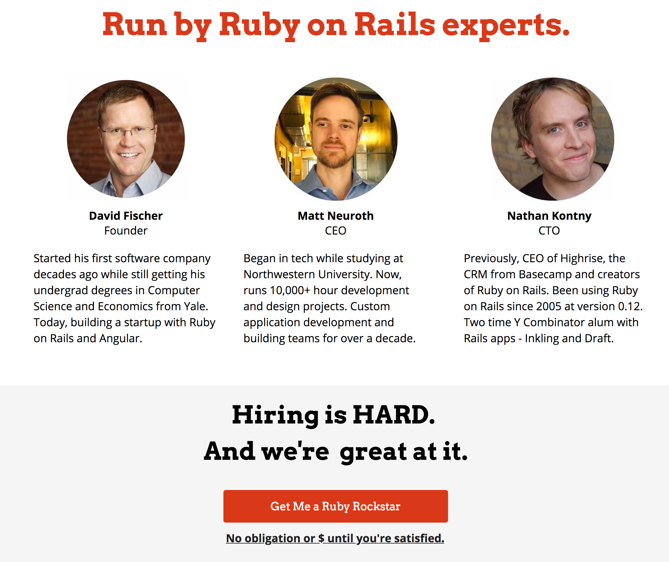
But it's also why you need as many credentials on your site that essentially say: "Here I am. I'm real. I'll be here tomorrow. You can contact us. You can come over to our office if you really wanted in case you need help."
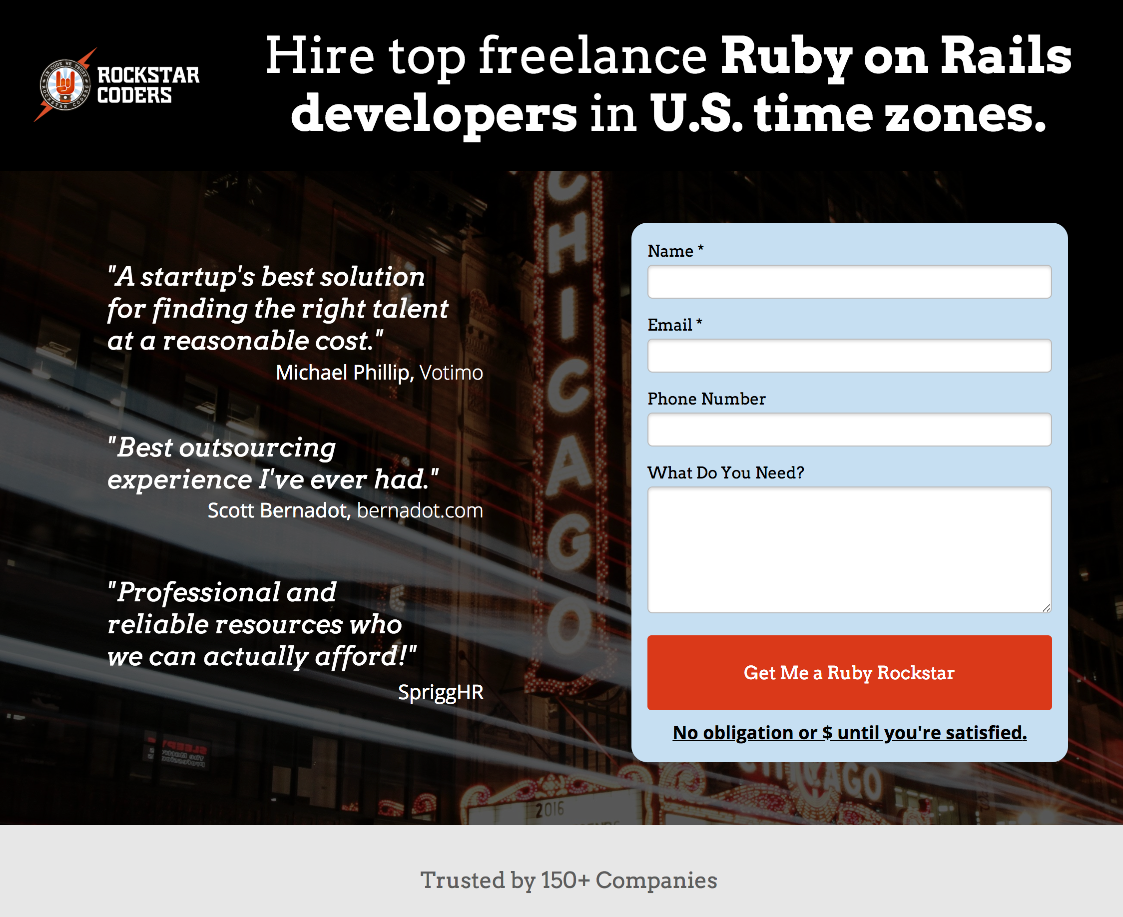
When I went through our landing page I noticed it mentions US timezones. But that wasn't enough. I wanted to play up the fact that we're here in Chicago and easy to reach. I added a background photo mentioning "Chicago."

Another nod to Chicago and our Bean in our "features."

And here's our address and social media accounts to talk to us online or in person:

Even if you aren't a social media maven and hate the vitriol on Twitter or the selfies on wherever, just do the basics. Tweet occasionally about your industry. Get your address on the page. Let people know you aren't fake news.
Whew! That was a lot of lessons from this single landing page design. And truth be told there are many more. About page speed, analytics, aesthetic design, Google AMP, etc. And they'll be coming. Stay tuned…


